Edition OneCohort ten opens 4 March20 critique seats$349 · one payment

Set type like you mean it.

A nine-week field course in editorial typography for designers who ship real work. Forty-two lessons, six live critiques, and a 180-page working manual you will actually keep on the desk.

Lifetime access. Thirty days to change your mind.

Filmed lessons42
Live critiques6
Manual pages180
Weeks9
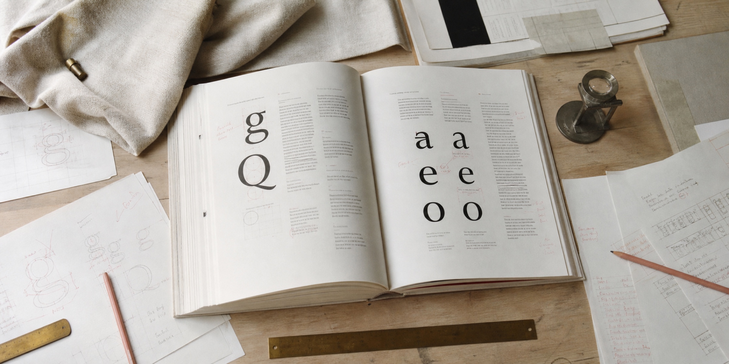
A typographer's desk photographed from directly above in soft daylight: an open course manual on a type-specimen spread, loose printed proofs annotated in dusty rose pencil, a brass ruler and a loupe on warm oat linen
42 filmed lessons6 live critiques180-page manualWorking InDesign + Figma filesLifetime accessSpecimen libraryCertificate on completion42 filmed lessons6 live critiques180-page manualWorking InDesign + Figma filesLifetime accessSpecimen libraryCertificate on completion42 filmed lessons6 live critiques180-page manualWorking InDesign + Figma filesLifetime accessSpecimen libraryCertificate on completion42 filmed lessons6 live critiques180-page manualWorking InDesign + Figma filesLifetime accessSpecimen libraryCertificate on completion
The problem

You can spot bad type. You can't always say why.

Every designer reaches the same wall. You know the layout is off. You nudge the line-height, try a different face, add a little letter-spacing, and it gets marginally less wrong. Then a senior designer moves two things and it snaps into place, and you still can't name what they did.

That gap isn't taste. Taste you already have — it's what makes the page bother you. What's missing is vocabulary: the small set of decisions typographers have been making deliberately for four hundred years, and that nobody taught you because they assumed you'd absorb it.

You won't absorb it. Nobody does. It has to be taught in order, on real work, with someone telling you what you got wrong.

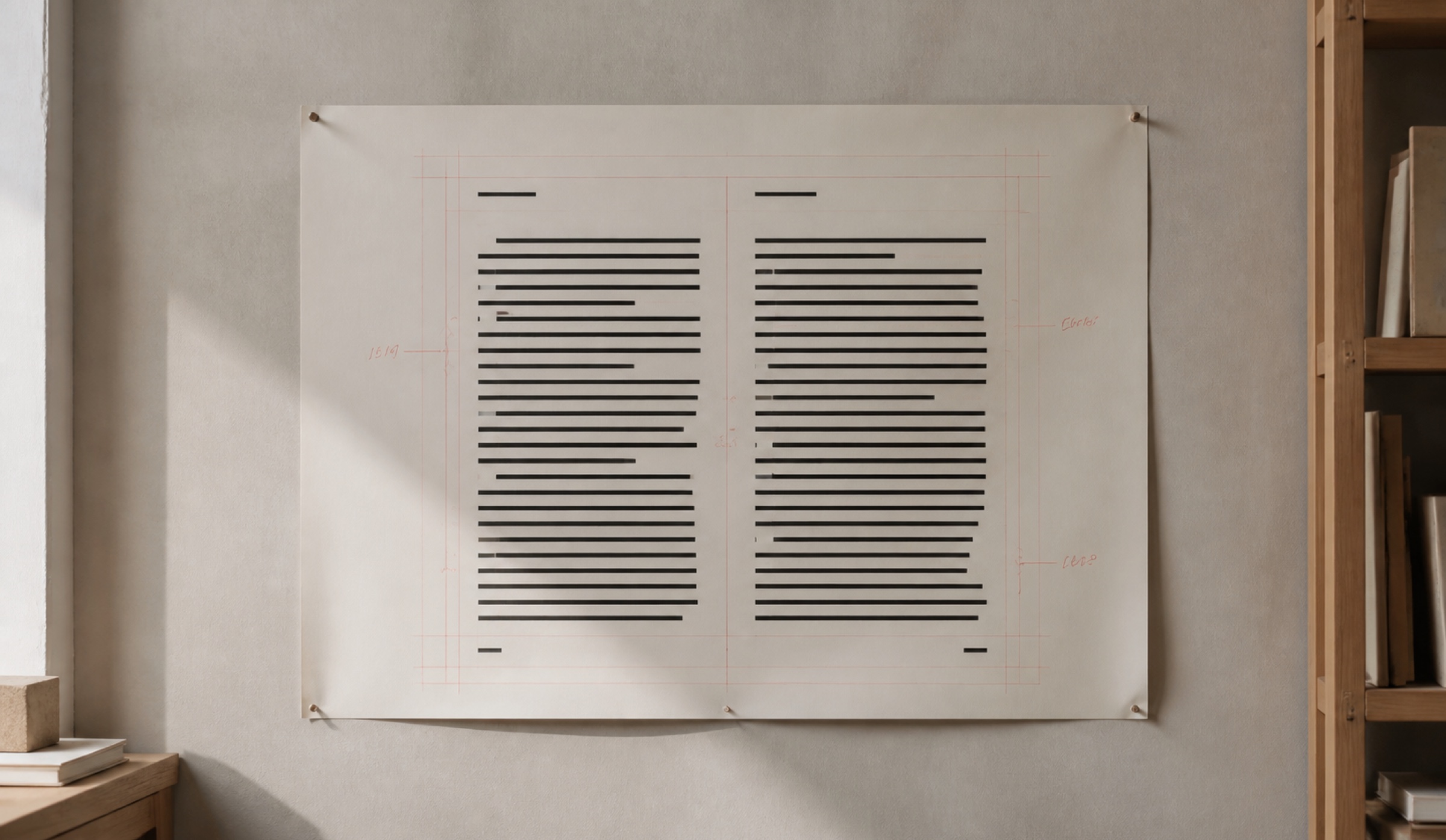
A large printed proof pinned to a plaster studio wall in soft daylight, an editorial spread marked up in dusty rose pencil with the baseline grid drawn in and the measure bracketed by hand
The shift

Typography is a set of decisions, not a set of fonts.

Primer teaches the decisions. Measure before face. Rhythm before ornament. Contrast as a system you can defend in a review rather than a feeling you have to apologise for.

By week three you will stop auditioning typefaces and start setting a page. By week nine you will have rebuilt four real pieces of your own work and be able to say, out loud, exactly why each one is now better.

Taught to designers at
Wordmark of a national daily newspaper set in a condensed slab serif, single dark ink on transparent
Wordmark of a design studio set in a lowercase geometric sans, single dark ink on transparent
Wordmark of a book publisher set in classical serif capitals, single dark ink on transparent
Wordmark of a software company set in a tight lowercase grotesque, single dark ink on transparent
Wordmark of an art museum set in wide letterspaced capitals, single dark ink on transparent
Wordmark of an independent magazine set in high-contrast didone capitals, single dark ink on transparent
What's inside

Six things arrive the day you enrol.

Nothing is drip-fed and nothing expires. The critiques run live on a schedule; everything else is yours the moment you pay for it.

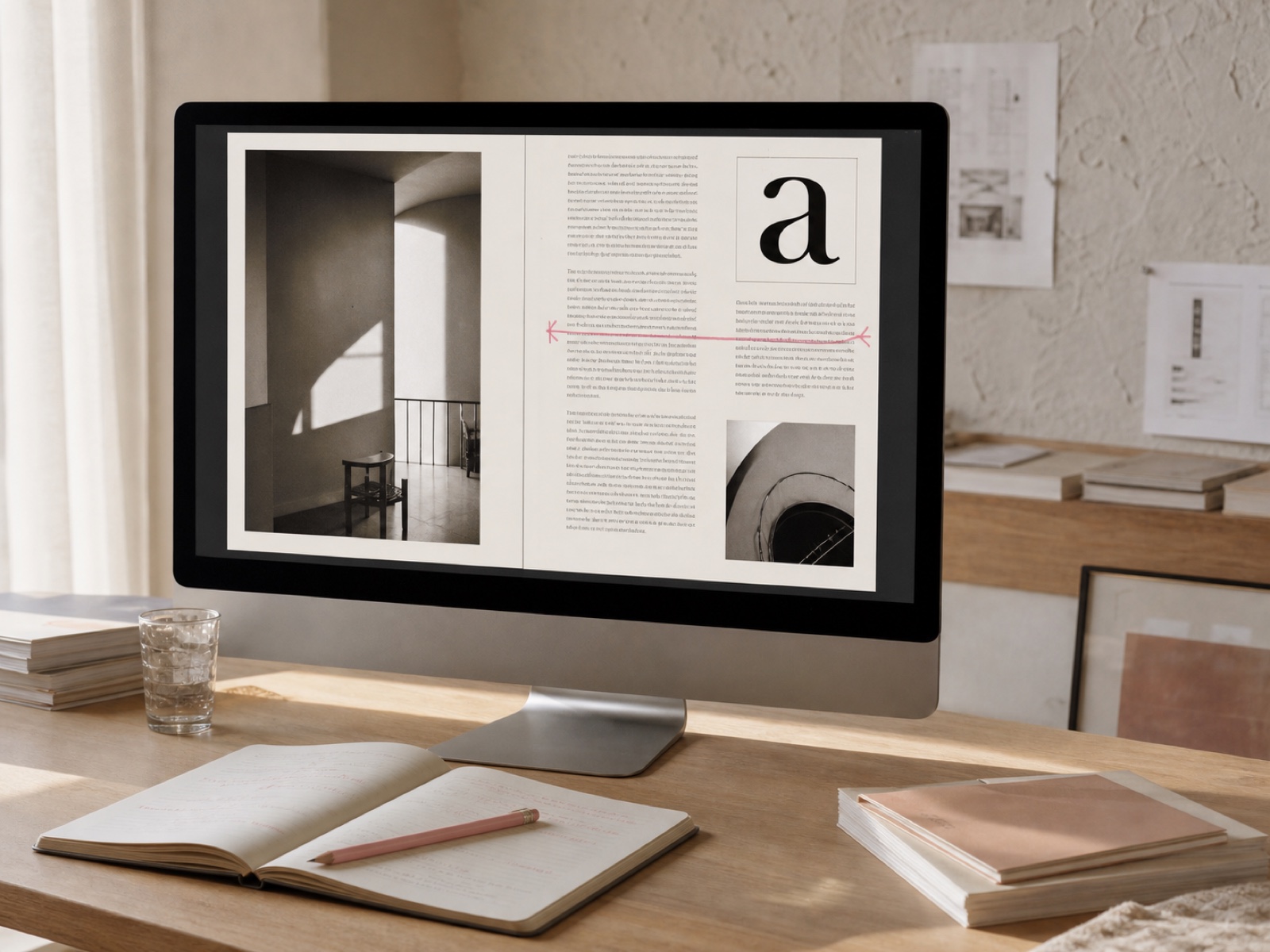
A still from a filmed lesson: a magazine layout open on screen with a rose measuring line drawn across the text column, warm daylight on the desk

42 filmed lessons

Twelve hours, cut tight. Every lesson is one decision, demonstrated on real editorial work from start to finish — no slide decks, no theory without a page attached.

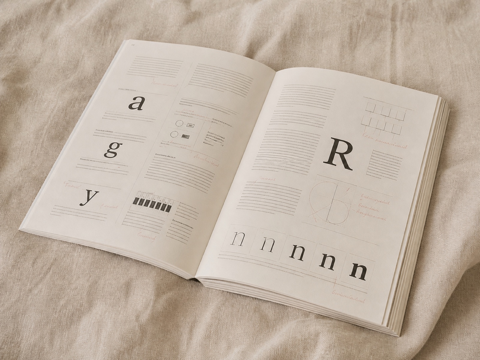
The printed course manual lying open on warm linen, a thick perfect-bound book showing a specimen spread, soft daylight and no hard shadow

The 180-page manual

A working reference, not a companion PDF. Printed and posted anywhere in the world, plus a DRM-free digital copy that you can mark up on the day it lands.

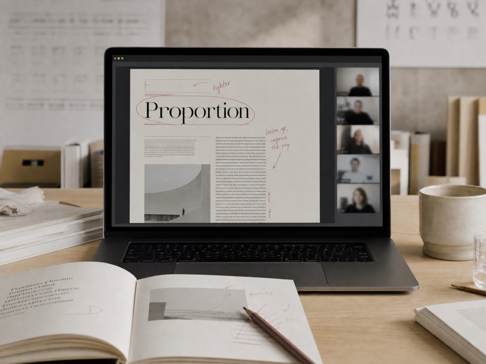
A live critique on a laptop screen: a student's page shared in a call with rose annotation marks drawn over the headline and the rag

Six live critiques

Ninety minutes each, capped at twenty seats, your work on the screen. This is the part that cannot be replaced by watching somebody else be corrected.

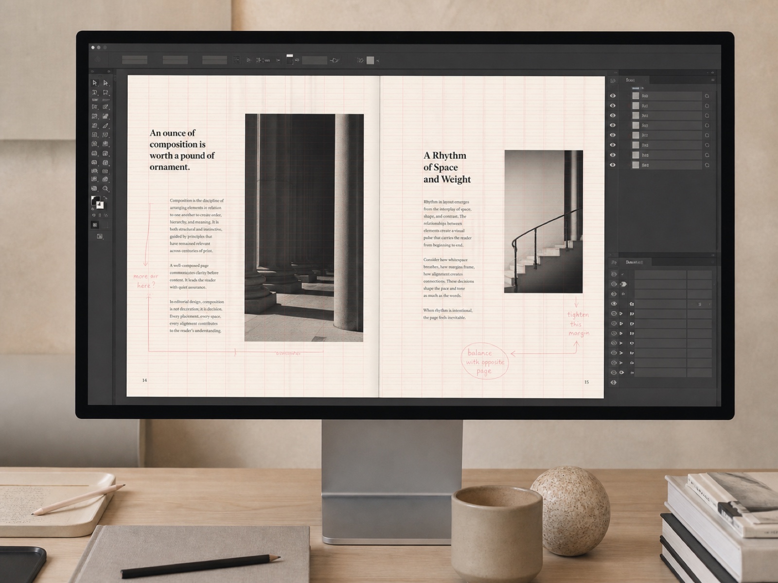
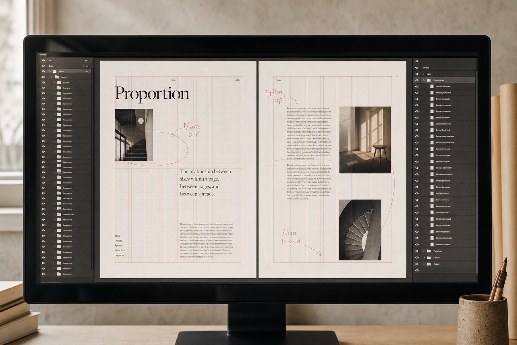
An InDesign document open with the layers panel exposed and the baseline grid visible over a two-column editorial spread

Every working file

The InDesign documents and Figma files behind all forty-two lessons, unlocked and unflattened, so you can take a layout apart rather than squint at a video.

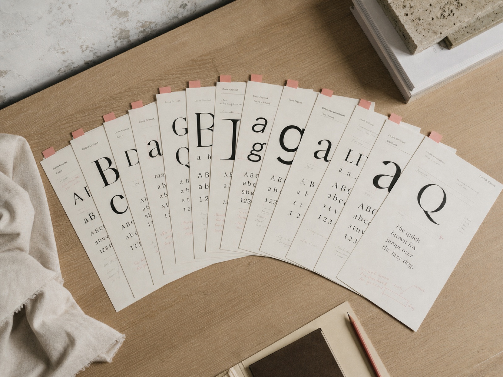
Type specimen sheets fanned across a pale desk, each tabbed with a small dusty rose paper marker

The specimen library

Ninety faces worth owning, each with a written note on what it is for, what it fights with, and the licence you will actually need to buy.

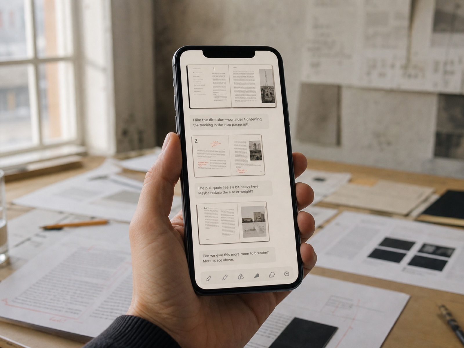
A phone held in one hand showing a studio chat thread full of layout screenshots and short written critiques, warm daylight behind

The studio channel

A private room with every past cohort in it. Post a page, get it read by people who have done the work. Access does not end when your nine weeks do.

The curriculum

Nine weeks, six modules, in this order for a reason.

Each module ends with a piece of your own work rebuilt and critiqued. You cannot skip ahead, and after week two you will not want to.

Week 1

The measure

Line length and leading, and why they are one decision rather than two. We set the same paragraph eleven times until the difference stops being invisible to you.

7 lessons1 h 48 m
Week 2

The face

Choosing type, and why the honest shortlist is far shorter than the foundry wants you to believe. Includes the licence maths nobody explains before an invoice arrives.

6 lessons1 h 32 m
Weeks 3–4

The scale

Building a type ramp that survives contact with a real CMS, a marketing team, and a headline nobody warned you about. Six steps, not fourteen.

8 lessons2 h 15 m
Weeks 5–6

The grid

Columns, gutters and the baseline — then the far harder lesson of when to break all three on purpose and still look deliberate about it.

8 lessons2 h 04 m
Weeks 7–8

The page

Hierarchy, entry points, and the rag. The module where most students say the thing they had been squinting at for years finally resolved.

7 lessons2 h 21 m
Week 9

The proof

Print, screen, and the review. How to test a page properly, and how to defend a typographic decision to someone who outranks you and wants it bigger.

6 lessons1 h 39 m
The product

Look at it before you buy it.

Most course pages ask you to take the material on faith. Here is the lesson player, a manual spread, a marked-up critique and the working files — photographed, not mocked up.

Open editorial typography proof with a ruler, paper strips, and a dusty-rose pencil on a pale oak worktable
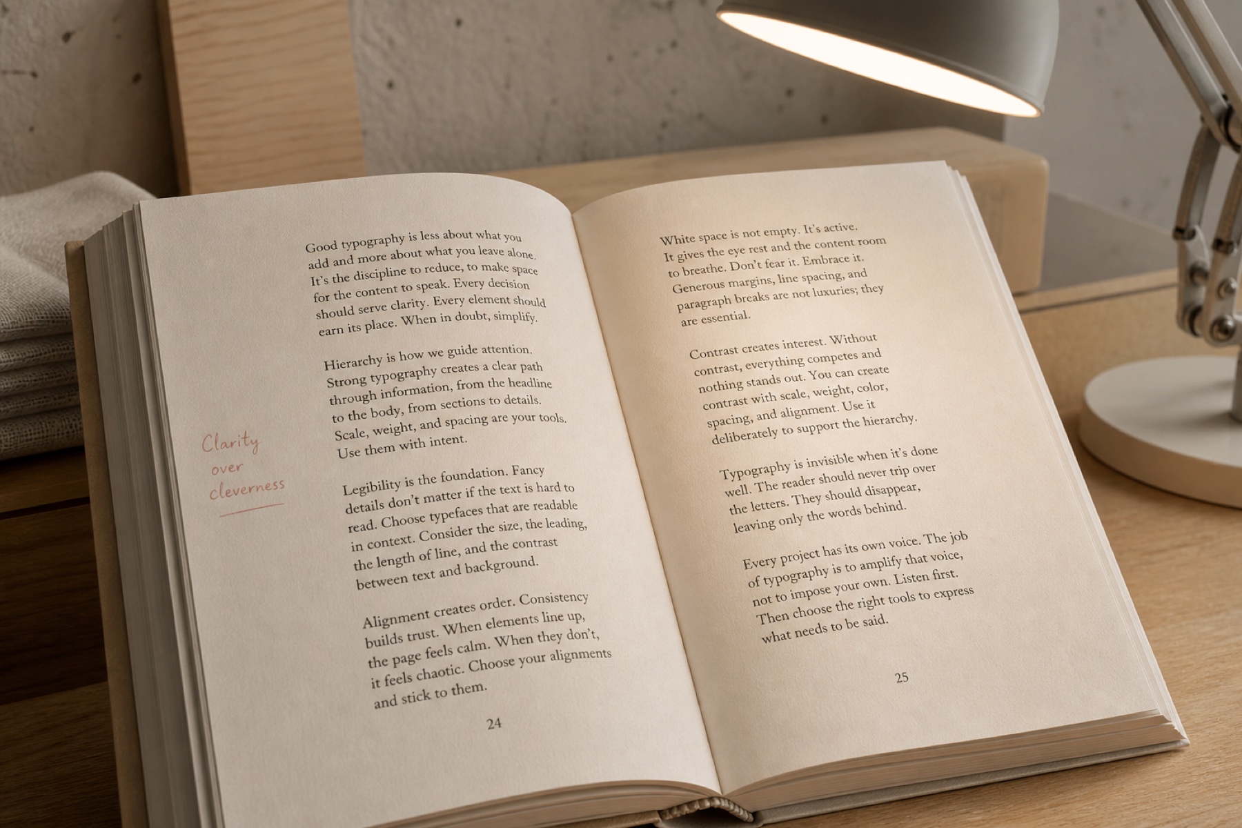
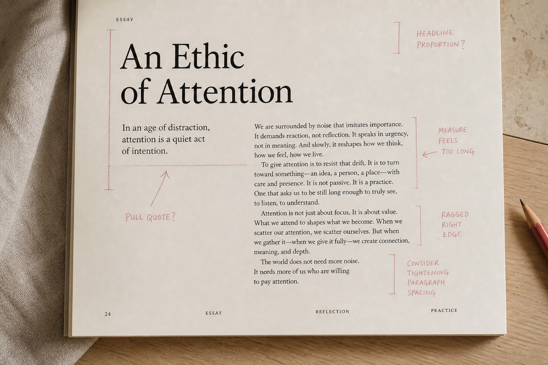
A manual spread photographed under lamplight, the running text set in two columns with a marginal note in rose inkThe manual
A student's layout covered in rose critique marks calling out the measure and the ragged right edgeA critique
An unlocked InDesign file in a dark interface with every layer exposed and the baseline grid switched onThe working files
Honest fit

This is not for everybody, and that is fine.

Take the course if you already ship work and it still isn't right

You design for a living, or you are close enough that a portfolio matters.

You can open InDesign or Figma without a tutorial, but nobody ever taught you type.

You want to be told what is wrong with your own pages, by name, out loud.

You have four to five hours a week for nine weeks, and you will actually take them.

Skip it if you want a font pairing list and a quiet afternoon

You have never opened a layout tool. Start somewhere cheaper and come back.

You want templates to ship on Friday. This teaches decisions, which is slower.

You are hoping to watch it through once at double speed. It will not take.

You would rather not show your work to anyone. The critiques are the course.

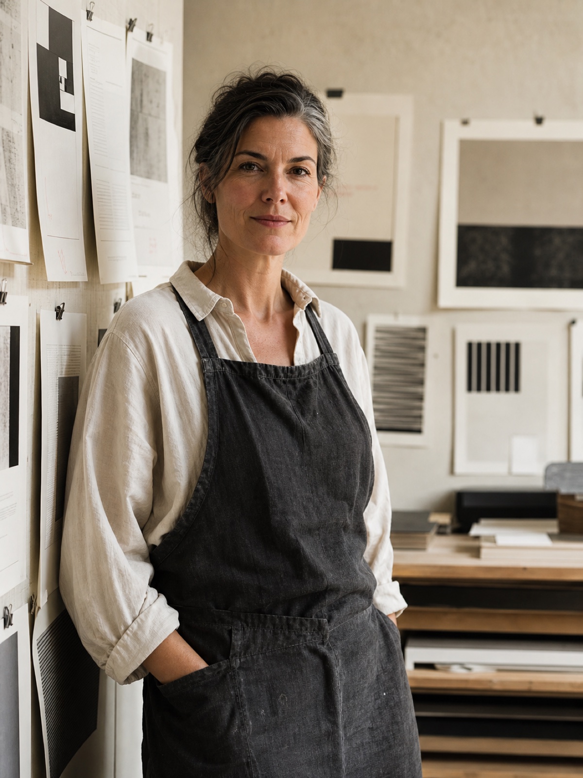
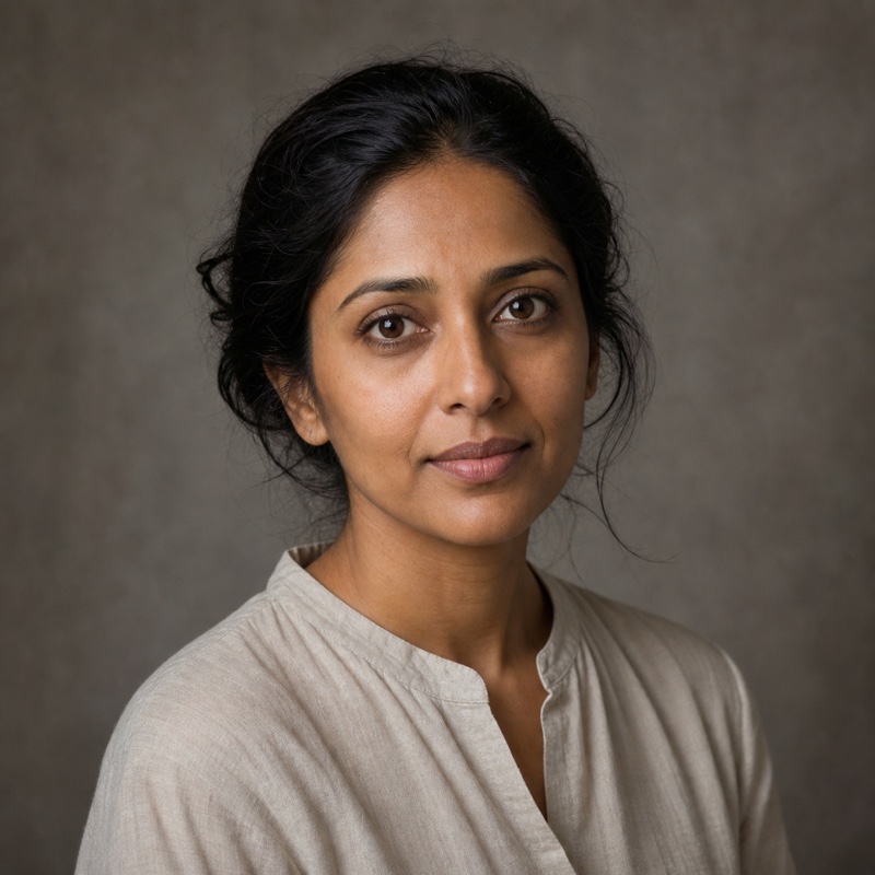
Della Voss, a woman in her forties in a linen work apron, standing beside a studio wall of pinned printed proofs in soft window light, looking directly at the cameraDella Voss · Rotterdam
Who is teaching

Della Voss has been setting type since before it was a job title.

Eighteen years of it. Nine as art director of a national weekly, where the front page had to be reset by hand every Tuesday night and there was never enough time to be precious about it. Four running the studio at a book publisher. Five freelancing for people who could not afford to be wrong in print.

I am not going to give you rules. I am going to give you the questions the rules came from, and then make you answer them on your own work.
Cohorts taught9
Designers through the course1,140
Years setting type18
The proof

Eleven hundred designers, and the same sentence keeps coming back.

I came in able to make things look nice and came out able to explain why they look nice. That second thing is what got me promoted.
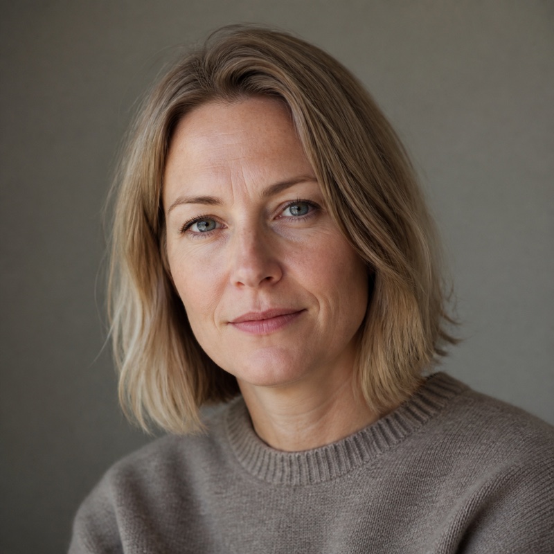
Square head-and-shoulders portrait of Esther Lindqvist, a woman in her thirties, soft plain background, natural daylight
Esther LindqvistSenior designer

Week four rearranged how I look at a page. I rebuilt our entire section front the weekend after and my editor asked who redesigned it.

Square head-and-shoulders portrait of Marguerite Okonjo, a Black woman in her forties, soft plain background, natural daylight
Marguerite OkonjoArt director, regional daily

I had watched maybe thirty hours of type videos before this. None of it stuck, because none of it was a person showing you a page and saying: that is too tight, here is why, fix it.

Square head-and-shoulders portrait of Sam Achterberg, a man in his late twenties, soft plain background, natural daylight
Sam AchterbergDesigner, software company

The working files alone are worth the fee. Being able to open the exact document and see how it was built beats any amount of watching.

Square head-and-shoulders portrait of Noor Haddad, a woman in her thirties wearing a headscarf, soft plain background, natural daylight
Noor HaddadEditorial designer

The critique is worth the whole fee. Watching someone take my page apart in real time was excruciating for about four minutes and then genuinely the most useful hour of my year.

Square head-and-shoulders portrait of Tobias Renner, a man in his fifties with grey hair, soft plain background, natural daylight
Tobias RennerProduct designer

Week one is eleven versions of the same paragraph and I nearly quit. By version nine I could see it. I think about that exercise every time I open a document now.

Square head-and-shoulders portrait of Priya Raghunathan, a South Asian woman in her thirties, soft plain background, natural daylight
Priya RaghunathanBrand designer

I bought it for the manual and stayed for the licensing lesson, which saved my studio about four thousand pounds in the first month. Nobody tells you that part.

Square head-and-shoulders portrait of Hilde Bakker, a woman in her sixties with short white hair, soft plain background, natural daylight
Hilde BakkerStudio owner
Enrolment

One payment. No subscription, ever.

Self-paced
$189one payment

The whole curriculum on your own clock. Everything except the live room.

All 42 filmed lessons, forever

The 180-page manual, digital and DRM-free

Every working file and the specimen library

The studio channel, with no end date

Buy self-paced — $189
Full courseIncludes the critiques
$349one payment

Everything above, plus the six live sessions where your own work goes on the screen.

Everything in self-paced

Six live critiques, twenty seats each

The manual printed and posted to you

Certificate, and a written end-of-course review

Enrol — $349
A circular embossed guarantee seal printed in dusty rose ink on cream paper, reading THIRTY DAYS around the edge

Thirty days, no argument

Work through as much as you like. If it has not changed how you set a page, reply to the receipt and the money goes back the same day — no form, no exit interview, and you keep the manual.

Buying for a team?

Three seats or more come with a shared critique slot and one invoice. Purchase orders are fine.

Get a team quote
Before you ask

The eight questions we get every cohort.

How much time does it take each week?

Four to five hours: roughly ninety minutes of lessons and the rest spent setting the exercise. The people who get the most out of it treat the exercise as the course and the video as the briefing.

Is there a beginner version?

No, and that is deliberate. Primer assumes you can already build a layout. If you cannot, the first four weeks will move too fast to be useful.

Do I have to buy typefaces?

Not to complete the course. Every exercise can be done with faces that are free to licence, and week two covers exactly when paying is worth it and when it is not.

Is the price in your currency?

Prices are in US dollars and charged as shown. Purchasing-power pricing is available for around forty countries — the checkout applies it automatically.

When do the live critiques run?

Every other Thursday at 18:00 CET, six times across the nine weeks. All six are recorded and posted, so a missed session costs you the room, not the material.

Are the videos captioned?

All forty-two, in English, hand-corrected rather than auto-generated. Transcripts are downloadable and the player runs at any speed without pitch artefacts.

Will this get me a job?

On its own, no, and be suspicious of anyone who promises otherwise. It will make your portfolio noticeably better and give you the vocabulary to talk about it.

What if it is not for me?

Reply to the receipt inside thirty days and the money goes back the same day. Under two per cent of students ask, and nobody has ever been argued with.

Cohort ten · opens 4 March · 20 critique seats

Nine weeks from now you could know exactly why it works.

One payment, lifetime access, and thirty days to decide it was worth it. The critique seats are the part that runs out.

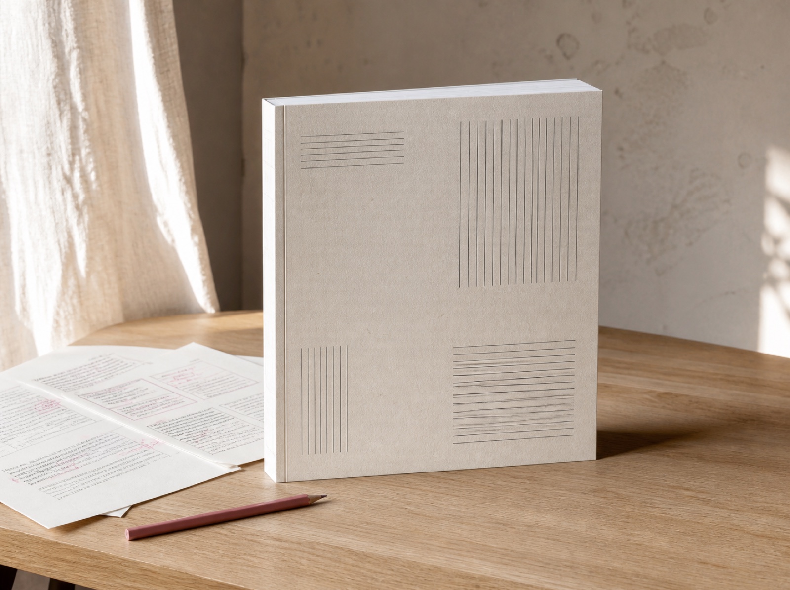
The printed course manual standing upright on a pale desk beside marked-up proofs and a dusty rose pencil, morning light raking across the paper
Primer

A field course in editorial typography, taught in nine weeks by Della Voss. Published by Primer Editions, Rotterdam.

Next cohort

Cohort ten opens 4 March. Twenty critique seats, and they have gone early every time so far.

Enrol — $349
© 2026 Primer EditionsSet in Gloock and FigtreeRotterdam · Netherlands
Swebsy