A rag is a shape, and you are allowed to design it.
Set a column of text ragged right and the software makes a decision for you every single line. It breaks where the next word will not fit, and it does not care what the resulting edge looks like. Most of the time that is fine. Perhaps one column in five, it is not.
There are three failures worth learning to see, and once you can see them you will never unsee them — which is the honest warning attached to this entire course.
The notch
One short line sitting between two long ones cuts a bite out of the edge. Your eye reads it as a gap in the paragraph rather than a break in a sentence, and the column stops feeling solid.
The false flush
Four or five lines that all end at nearly the same point read as a failed attempt at justification. A rag has to look intentional, and near-straight is the one shape that never does.
The ladder
Hyphens stacked on consecutive lines. Two is survivable, three is a ladder, and a ladder pulls the eye down the margin instead of across the line.
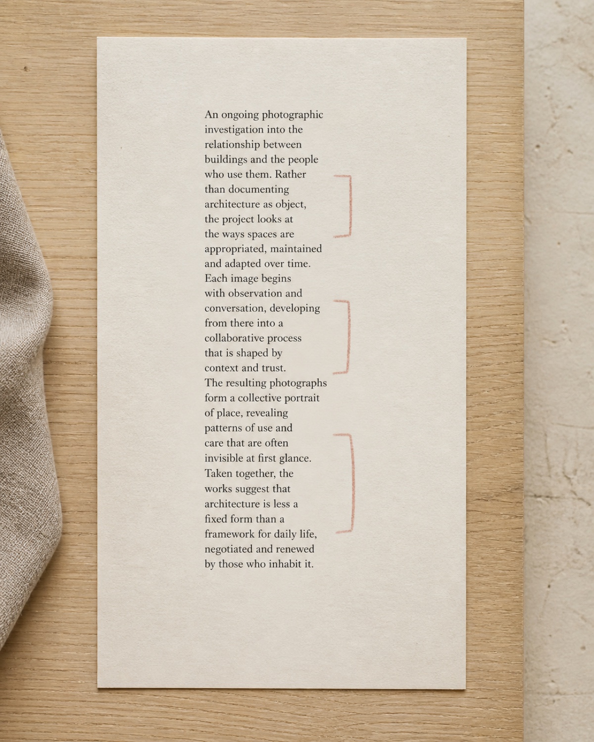 Notched
Short lines trapped between long ones. The edge reads as damage.
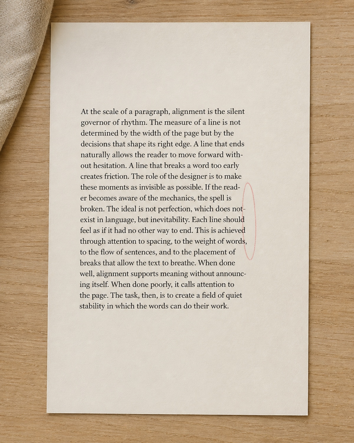 Near-flush
Almost straight, plus a hyphen ladder. Reads as a mistake, not a choice.
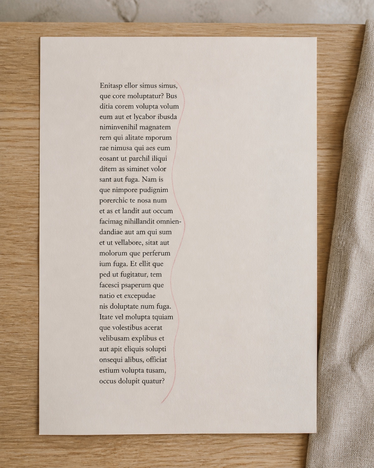 Designed
An even step, no ladder, no notch. Four manual breaks got it there.
Open the last thing you set in two columns. Turn hyphenation off, print it, and draw the right-hand edge of each column as a single line without looking at the words. If the line you drew has a notch, a ladder or a straight stretch, you have found the four breaks worth putting in by hand.
A good rag is not random. It is a shallow, even step that nobody notices — which is the whole job, most days.