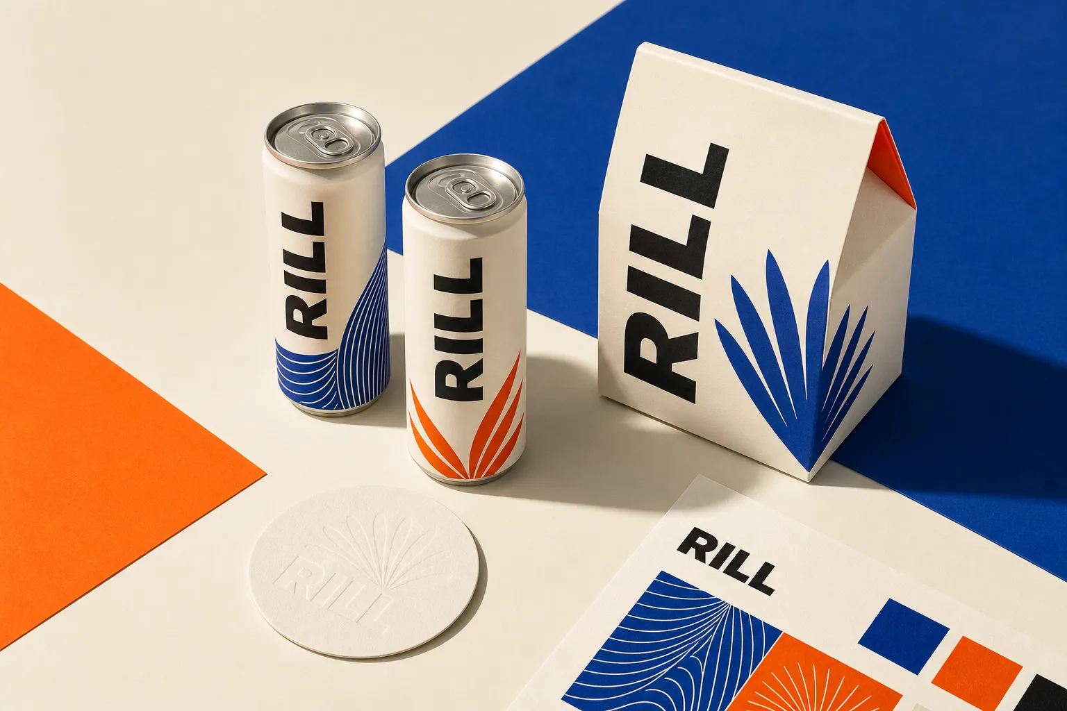
Rill · Brand launch · 2026
Positioning, identity, packaging, campaign system, and launch site for a sparkling tea that refused to whisper.
Category
Food & drink
Engagement
Two sprints
Launch
Spring 2026
The assignment
Rill had a distinctive product and an indistinct category problem: botanical drinks either looked medicinal or disappeared into wellness beige.
The founders needed a position that felt credible to specialty retailers without sanding away the energy that made early customers care.
We centered the brand on a simple tension—grown slowly, enjoyed immediately—and built a visual system that paired natural materials with assertive commercial color.
Design language
A compact wordmark, an expanding leaf-line device, and color that holds its own from a fridge door.
Warm ivory · Botanical cobalt · Citrus orange · Ink
The system
Position
Not another health claim. A bright, grown-up alternative to the second coffee and the first cocktail.
Identity
Repeating botanical lines, hard crops, and compact typography gave every format the same energetic cadence.
Launch
Packaging, retail sell-in, social launch, sampling materials, and the website all moved as one campaign.
After launch
to sell out online
retail accounts opened
email launch conversion
second production order
Two September starts